
20 August 2026 · Paul Lancaster
Finding the Picture: Illustrating The Play's the Thing
Paul Lancaster on the evolution of a Martin Travis cover
People sometimes assume that illustrating a book begins with reading it. In my experience it usually begins rather earlier, with a conversation in which an author and a publisher attempt to describe a book they have been living with for months and an illustrator attempts to discover which parts of what they are saying might eventually become a picture.
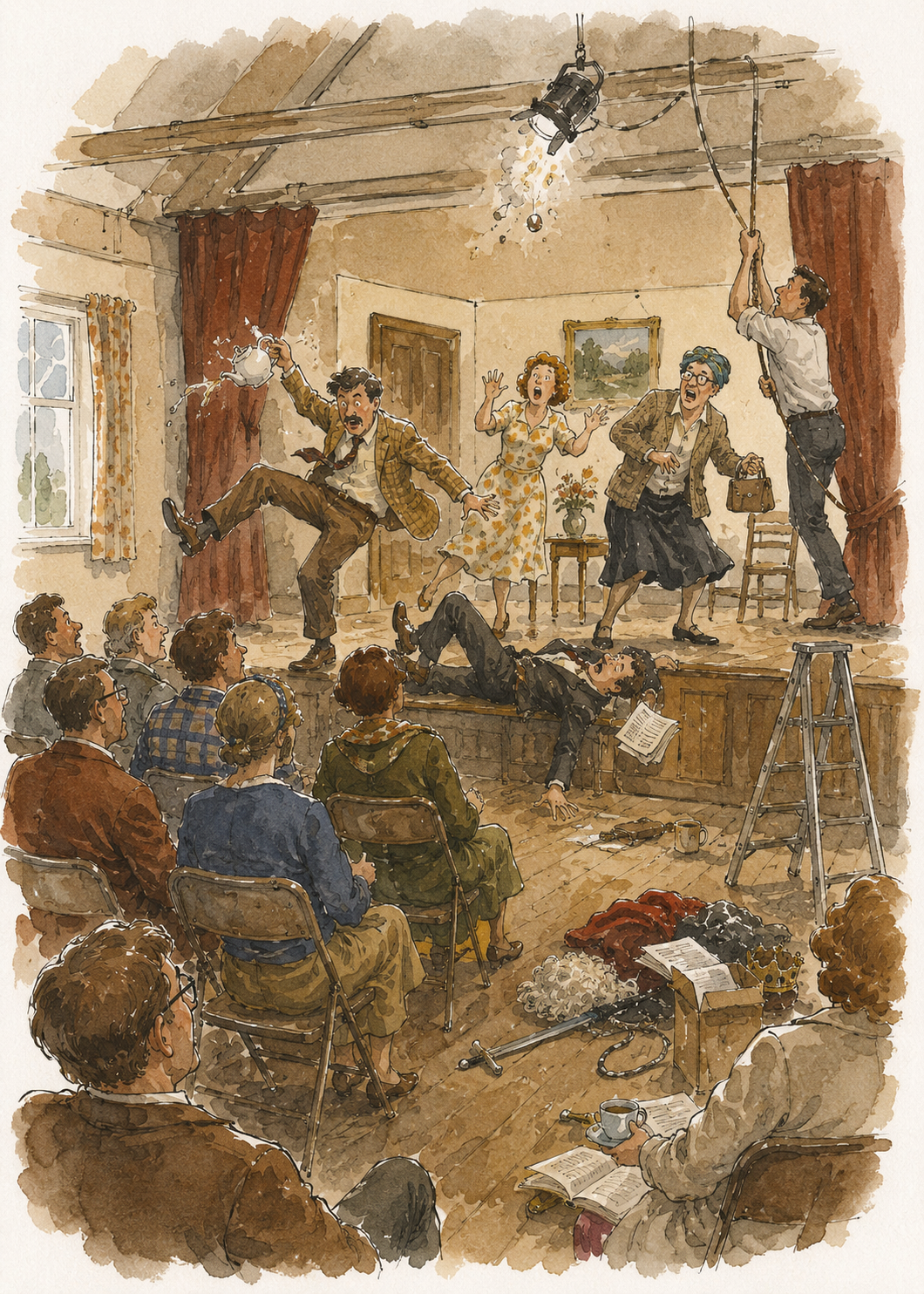 Concept 1
With the Martin Travis books those conversations have acquired a certain history. I have illustrated enough of them now for Martin, Nadia Dixon at Paeon Press and me to possess a small vocabulary of references which would probably be incomprehensible to anyone else. We can talk about the balance of people and buildings, whether something is too literal, whether the background is doing too much work, whether a figure has become too definite, whether the drawing needs more air. Sometimes Martin will refer to an earlier cover—Going Up, perhaps, or one of the Northwick books—and what he means is not that the new picture should resemble it, but that there was something in the relationship between figure and setting that worked. Nadia may remember a different cover for an entirely different reason. My job is to listen to all of that and then, eventually, stop listening long enough to draw.
The Play's the Thing was particularly interesting because its subject appears, at first, almost dangerously easy to illustrate. It is a novel about an amateur dramatic society putting on a play. There is a hall, a stage, actors, a director, scenery and props. One could put all of those things into a drawing and produce something perfectly accurate which nevertheless said almost nothing about the novel.
That is one of the traps of book illustration. Accuracy and truth are not quite the same thing.
Before the drawing
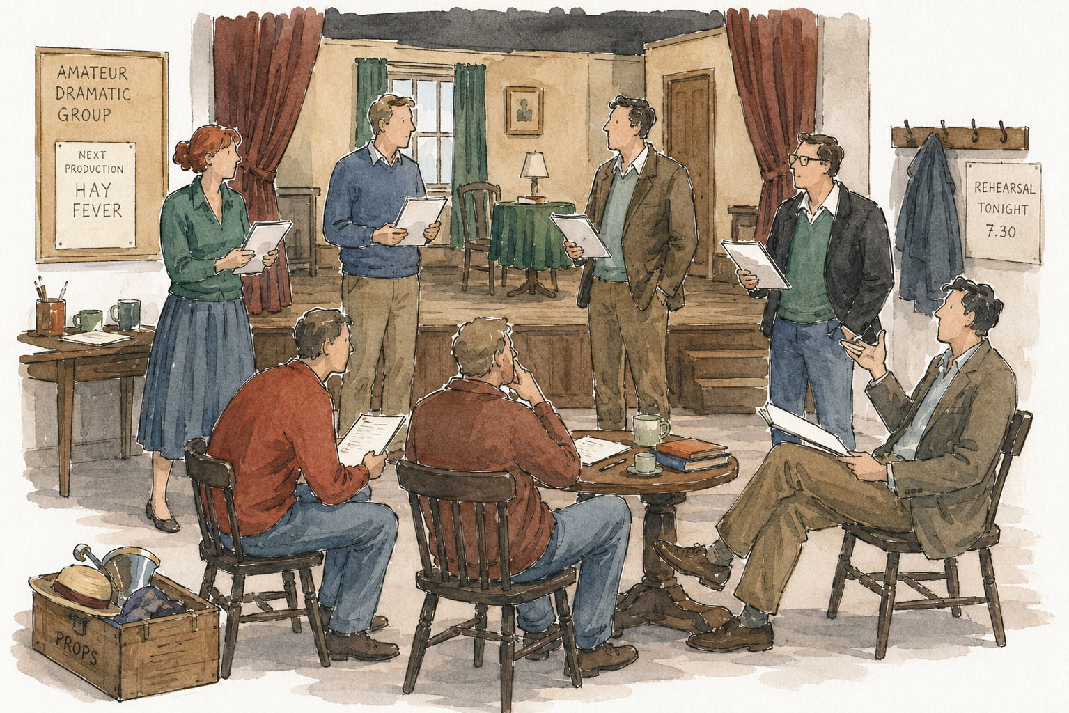 Concept 2
The first discussions are therefore quite broad. What sort of book is this? Where does it belong in relation to the other Travis novels? What must the cover communicate before somebody has read a word of it?
The earlier books had already answered some of those questions for us. The Northwick Trilogy established the importance of place. Buildings matter enormously in Martin's fiction, partly because institutions matter: universities, colleges, departments, suburban communities. College Business could hardly avoid architecture because the college itself is almost a participant in the comedy. Scenes of an Academic Nature similarly required an institutional world to be present without allowing the architecture to overwhelm the people inhabiting it.
Other books pushed us in the opposite direction. With Going Up we discovered how useful a comparatively anonymous human figure can be. The less specifically a face is described, the easier it becomes for the reader to enter the picture. The Trouble with Will raised another version of the same problem. Illustration can become too explanatory. If you tell readers exactly what somebody looks like, you have removed one of the pleasures the novelist has deliberately left to them.
Over the course of the covers we have therefore moved towards a visual language of fairly free pen drawing, selective colour wash and figures who are observed without being exhaustively defined. The drawings have edges, but the pictures do not necessarily have them. A line can disappear. A wall need not reach the border. Colour can suggest a coat without conscientiously filling it in.
That freedom became important with The Play's the Thing.
Finding the subject
The obvious subject was a rehearsal. That much emerged quite early. But "a rehearsal" is not yet an illustration. It is simply a category.
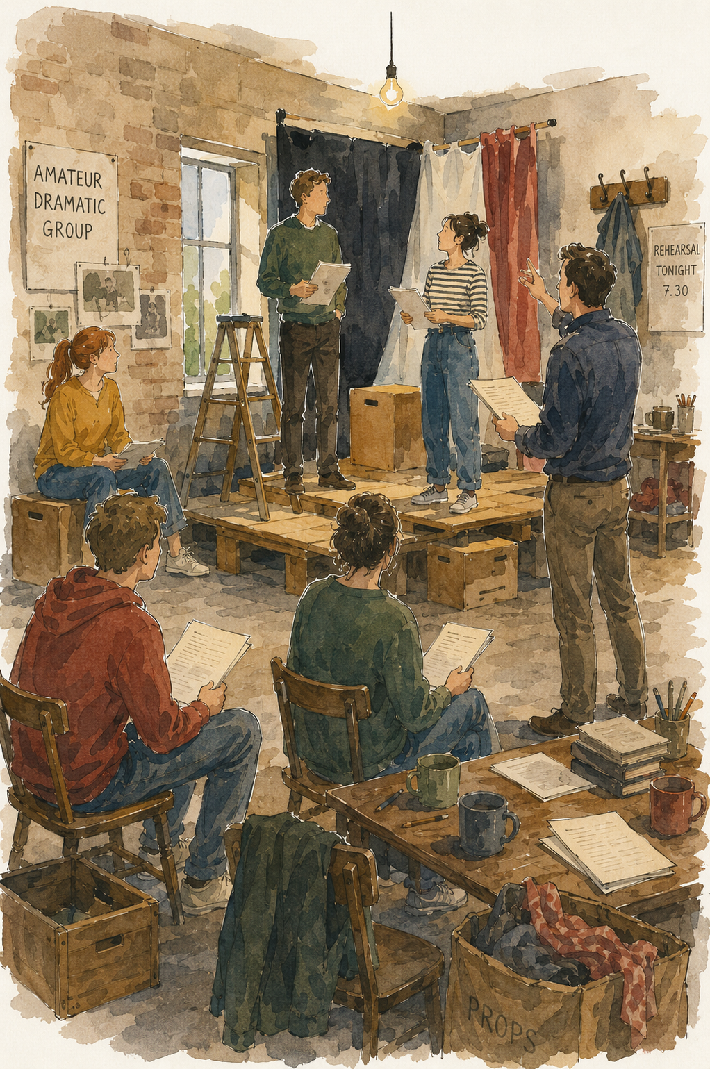 Concept 3
What sort of rehearsal? From where are we watching it? Is the stage the subject? Are the actors? Is this a picture of theatre, or of people trying to make theatre?
That last distinction mattered.
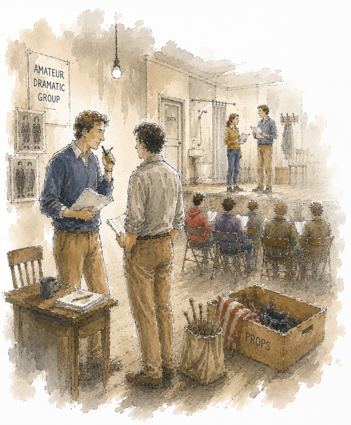
Professional theatre carries its own glamour. Amateur theatre carries chairs, tea, handbags, bits of scenery, duplicated scripts, people who have come directly from work and somebody who knows where the extension lead is kept. Martin's novel is affectionate about that world precisely because it takes seriously the enormous effort expended on something which, from outside, may look rather small. I wanted the illustration to contain both things: the modest circumstances and the seriousness of purpose.
The first sketches were therefore exploratory. They contained more information than the final picture was ever likely to need. This is often necessary. Before deciding what can be left out, I need to know what might be there.
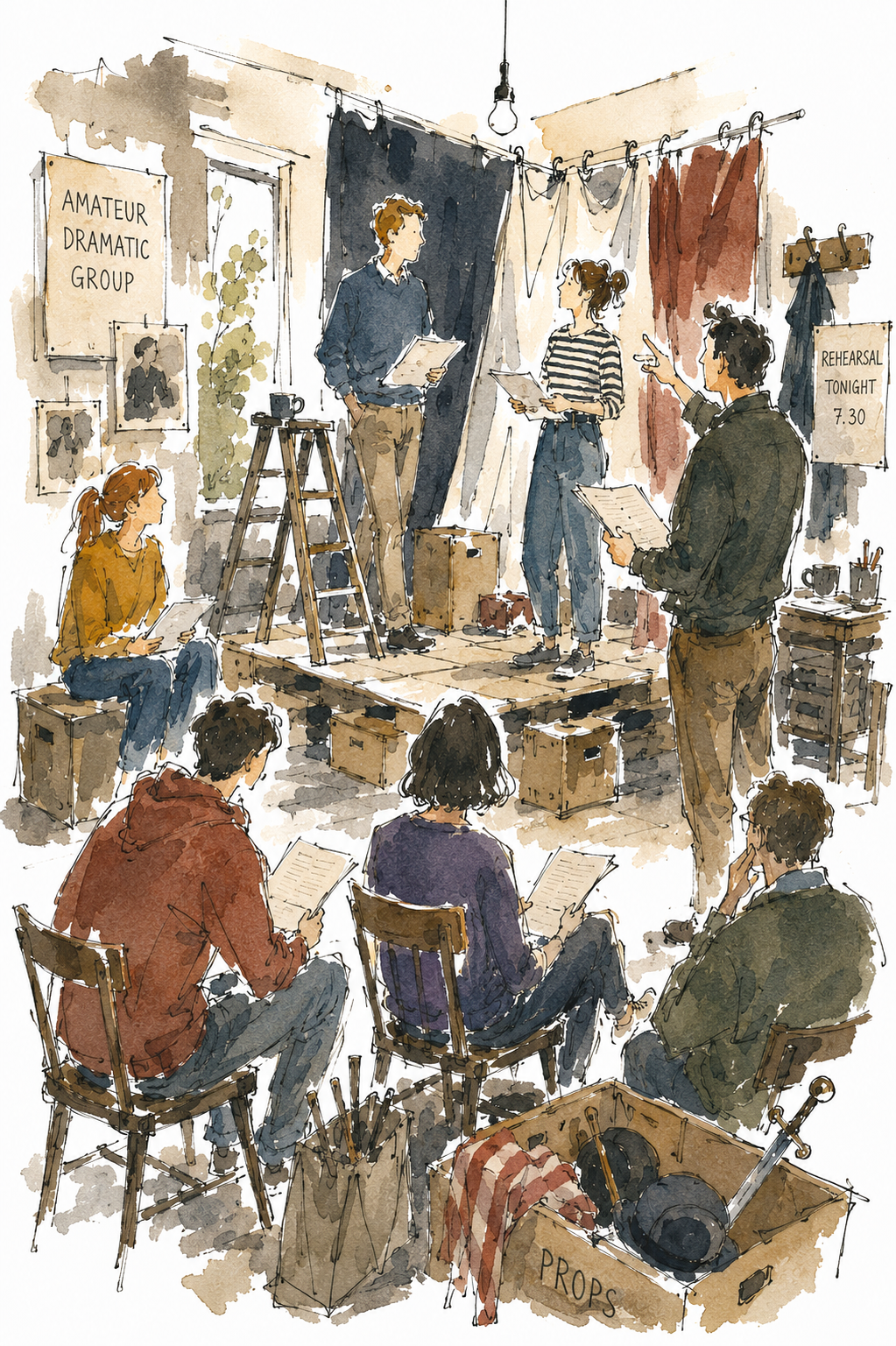
The hall had to be established. So did the stage. There had to be enough theatrical paraphernalia for us to understand immediately what was happening. Figures needed to occupy the space. There were props and furniture, notices and scenery. At one point there was even a sword in a prop box.
The sword did not survive.
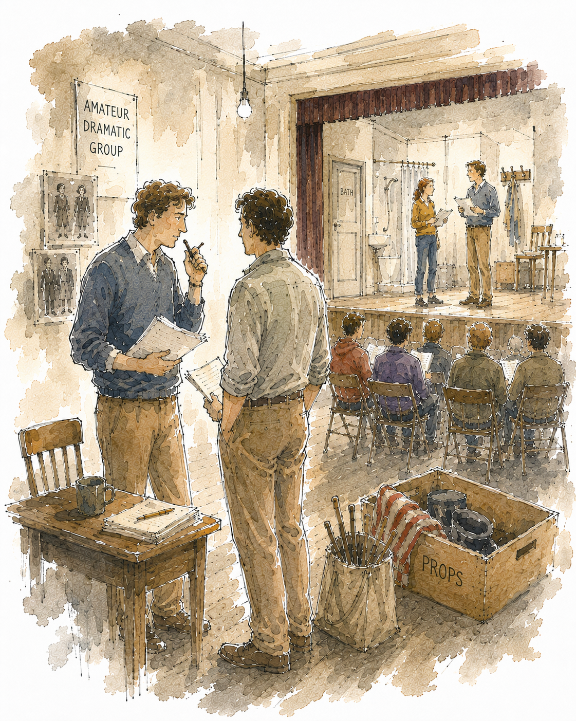
This may sound an absurdly small decision, but such things matter. A sword attracts the eye. It announces "theatrical prop" rather efficiently, but it also begins telling a story of its own. Why is there a sword? What sort of play are they doing? Once the play within Martin's novel had become clearer in my mind—a farce set in a boarding house in which a bathroom is important—the sword was not merely unnecessary; it was misleading. Out it came.
That is fairly typical of the process. The broad decisions are made first, but the picture is eventually won or lost through dozens of small ones.
Reading changes the picture
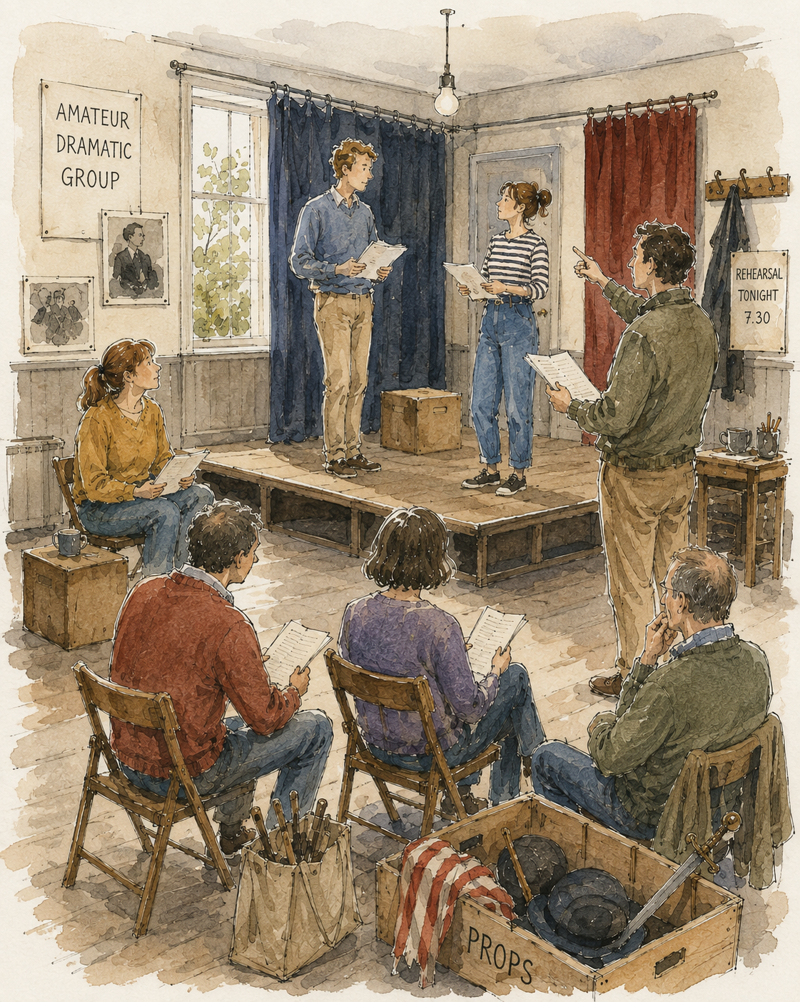 Concept 4
There is an important stage between the first conversations and the later drawings: reading the novel.
An illustrator's first sketch is often a response to what a book has been described as being. The later drawings respond to what it actually is.
Reading The Play's the Thing altered my sense of scale. The novel is ostensibly about putting on a play, but the comedy is generated by the people doing it: their vanities, hesitations, rivalries, competence and occasional heroic willingness to undertake jobs for which they have no obvious qualification. The stage matters because of what it does to the people around it.
That suggested that simply drawing the whole hall and filling it with activity was not enough. The more complete the room became, the less interested I was in it.
This was a problem we had encountered before. Martin is fond of settings that can be described architecturally, and I am fond of drawing buildings. It is therefore quite easy for both of us to end up with a handsome picture of the wrong thing.
The answer was to change the hierarchy.
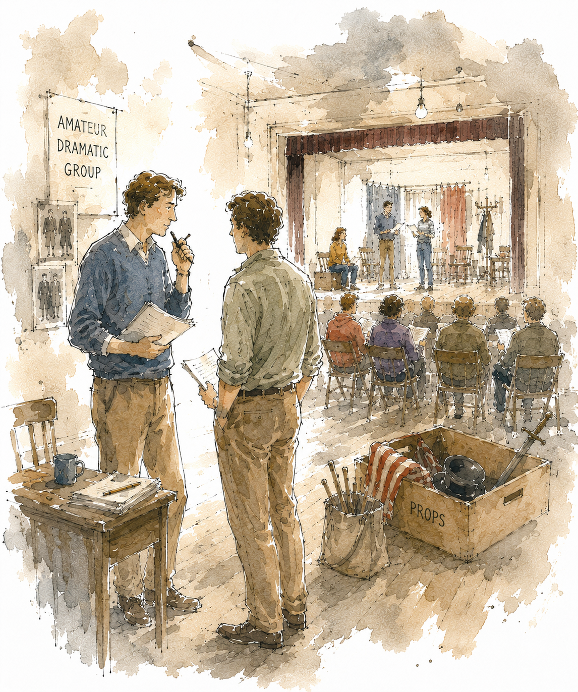
Rather than looking at the entire rehearsal from a comfortable distance, the later versions began bringing two figures much closer to us: a director and an actor, or two people conferring at the edge of the rehearsal. Behind them could sit another group of actors; farther away again was the stage.
Immediately the picture acquired depth in two senses. There was physical depth—foreground, middle distance, background—but also narrative depth. The foreground figures gave us an entry point. Beyond them we could discover the rest of the society.
That relationship between a definite foreground and a progressively freer background is something we have returned to on several of the Travis covers. It suits the books. Martin's comedy frequently works by beginning with somebody's immediate problem and allowing the institutional or social world behind it gradually to become visible.
I began to think the drawing should do the same.
How much stage?
The stage went through several incarnations.
Initially it was rather makeshift. That conveyed amateur dramatics efficiently but overdid the point. Amateur does not necessarily mean ramshackle. These people may not be professionals, but they take what they are doing seriously. The hall is supposed to accommodate an audience of roughly a hundred and the stage belongs to it; it should look like a proper small proscenium stage, not something assembled from packing cases half an hour before rehearsal.
 Concept 5
So the architecture became more convincing.
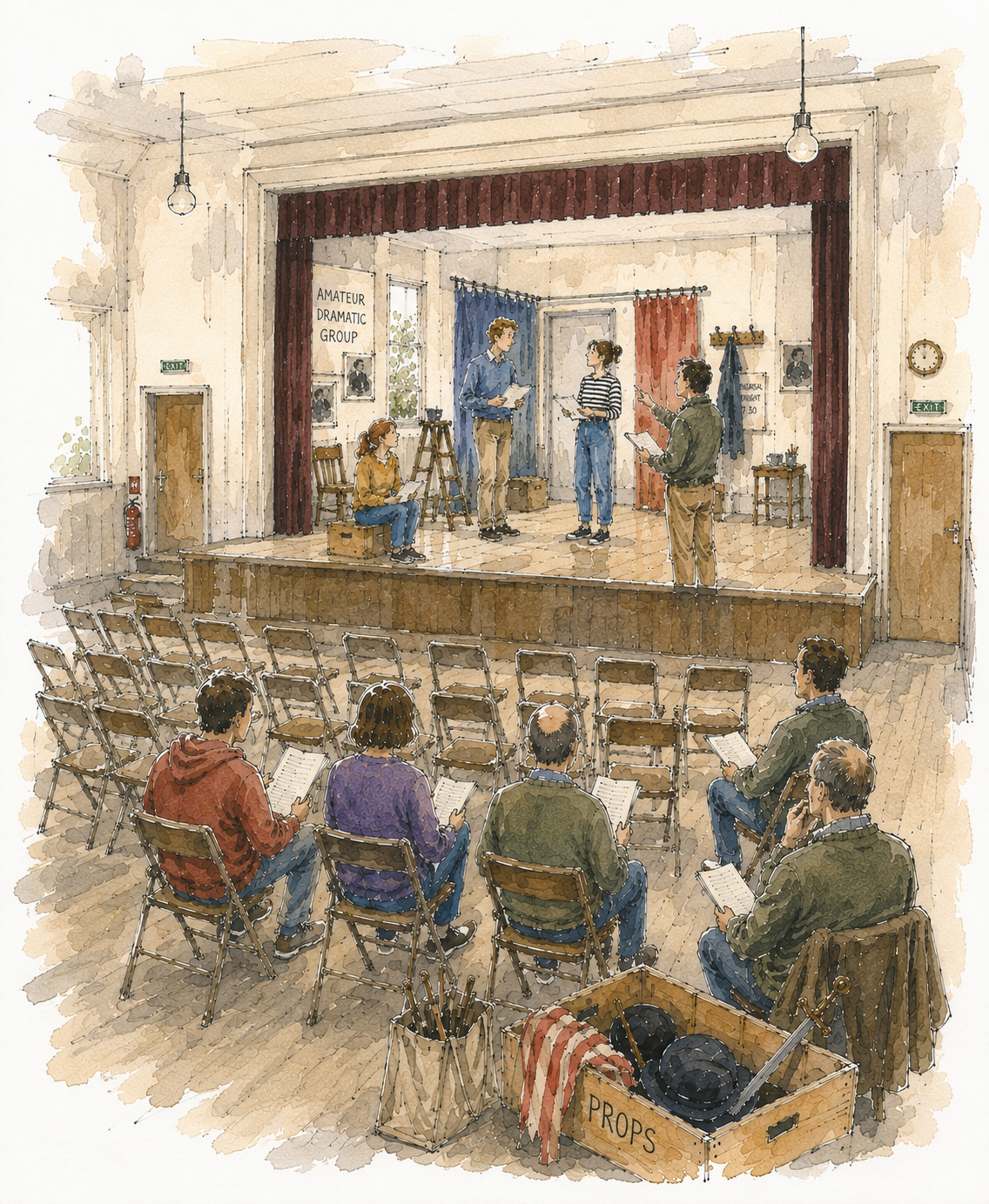
Then another problem appeared. The better I made the stage, the more it competed with the people.
We tried seeing its full width. That explained the room beautifully and flattened the illustration almost completely. The eye went to the stage because stages are designed to make eyes go to them.
The eventual solution was not to abolish it but to let it escape.
We see enough of the left-hand side to understand the proscenium and the set. Posters and details on the wall establish the theatrical environment. There are hints of the boarding-house bathroom required by the play. But towards the right the stage becomes less insistent. Lines loosen. Wash disappears. The drawing declines to finish everything it has started.
This was one of the most important decisions in the whole process.
A picture does not have to give equal weight to everything that exists.
Drawing less
The same principle affected the people.
 Concept 6
Earlier versions were more evenly populated and more evenly described. The trouble with that is that a group scene can become democratic in the wrong way. Twelve figures all drawn to the same degree of finish become twelve competing claims on the eye.
So the foreground figures grew larger.
The people behind them became looser.
Faces became less specific.
Some lines disappeared altogether.
This is not quite the same thing as making the illustration sketchier, although that was often the word we used in our discussions. What we were really doing was deciding where the drawing should know things.
It should know quite a lot about the foreground. It should know enough about the middle distance. By the time it reaches the back of the hall, it can afford to become forgetful.
That is where the colour wash also becomes useful. I do not want colour to behave like paint-by-numbers, obediently filling every shape produced by the pen. It can cross a line, stop before one, intensify unexpectedly and disappear altogether. On several earlier covers we had found that the liveliest results came when the drawing retained the feeling that it might still be in progress.
Martin has occasionally sent a version back with the apparently contradictory request that it should be both more finished and less finished. I know what he means.
Usually.
The importance of air
 Concept 7
One of the less obvious changes concerned the edge of the image.
A conventional rectangular illustration immediately announces itself as an object placed on a cover. There is nothing wrong with that, but it is not quite the quality we have developed for these books. We wanted the Travis illustrations to sit on the page more lightly.
So the borders became increasingly irregular and increasingly generous.
This is not simply decorative. Allowing the ink and wash to fade into the surrounding paper changes the apparent scale of the drawing. The hall feels larger because we do not see exactly where it ends. The illustration breathes. The blank paper becomes part of the composition.
This was particularly useful here because the subject itself could so easily become cluttered. A rehearsal room naturally accumulates things. Chairs, tables, scripts, scenery and people all demand marks on the page. The generous unfinished border prevents that accumulation from becoming oppressive.
Again, it is a lesson learned across several covers rather than invented for this one. Sometimes the most valuable instruction from Martin or Nadia has been some version of "give it more space." It sounds simple. It rarely means merely making the picture smaller.
Nadia, Martin and the third opinion
Book covers are unusual illustrations because they are collaborative objects pretending to be individual ones.
Martin naturally knows the fictional world better than anybody. He will notice when a piece of scenery implies the wrong sort of play, when a character has become too young or too old, or when an incidental detail has acquired an importance it does not possess in the novel.
Nadia looks at the image differently. A publisher has to see the cover at the size at which somebody encounters it online, across a bookshop or in a catalogue. A beautiful detail which only works when the original is lying on my desk may be useless on a paperback.
 Proof Cover
And I have to remain sufficiently disobedient to both of them to protect the picture.
The useful part is the conversation between those three positions.
It has happened throughout the series. A comment about a figure on one of the Northwick covers affects the way people are handled several books later. A discussion about architecture on College Business resurfaces when we are deciding how much of a suburban hall needs to be drawn. The looseness developed on one cover makes us braver about leaving another incomplete. The books do not look identical, nor should they, but they belong to the same visual family.
There is a cumulative confidence in working together. "Too literal" now means something to us. So does "more air." So does "the background is taking over."
Occasionally it means "lose the sword."
When to stop
The difficult thing about a sequence of thirteen versions is that improvement is not linear.
A later drawing may solve one problem and introduce another. Making the architecture more accurate may make the image less lively. Enlarging the foreground figures may improve the composition while losing a particularly good accidental mark in the background. A wash can become richer and simultaneously make the whole thing too painterly.
There is always the temptation to believe that one more version will contain every virtue of all the previous ones.
It won't.
Eventually the task is to recognise which losses matter and which do not.
For The Play's the Thing, the final direction emerged when the illustration ceased trying to describe an amateur dramatic rehearsal comprehensively and began to behave more like one's experience of being at one. There are people close to us. Something is happening beyond them. The stage is present but not dominant. Details emerge if we look for them. Other things are merely suggested. The picture has a centre without having a hard boundary.
And somewhere in the process a prop box lost its sword.
That journey from deciding what the picture is about to deciding whether one tiny object should remain in one corner is, for me, the interesting part of illustration. The large decisions and the minute ones are not really separate. They are all attempts to answer the same question.
What does the reader need to see?
The answer is almost never everything.
 Final Cover